Cordica Brand Identity
Cordica Brand Identity
CordicaBrand Identity
Three companies. Thirty years of expertise. One new name. When TEAM Technologies, Duke Empirical, and TAG3 Engineering came together to form a single advanced medical device manufacturer, they needed more than a merged org chart — they needed a brand that could unify 2,700+ employees and tell a story that none of the three legacy brands could tell on their own.
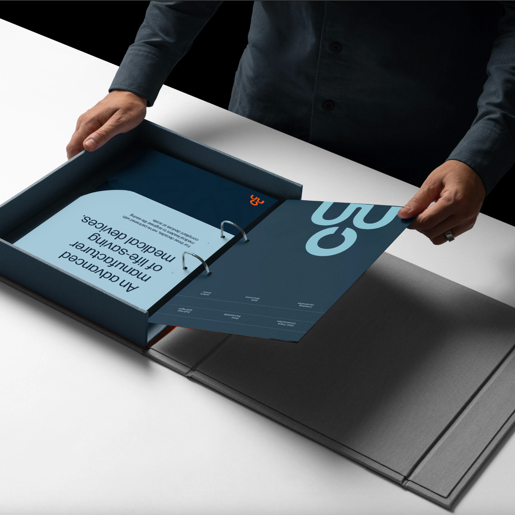
This January led the naming, brand identity, and vision film for the newly formed company — building Cordica Medical from scratch as a brand that could hold the weight of what they actually do: design, develop, and manufacture life-saving medical devices from concept to commercialization.
The Name
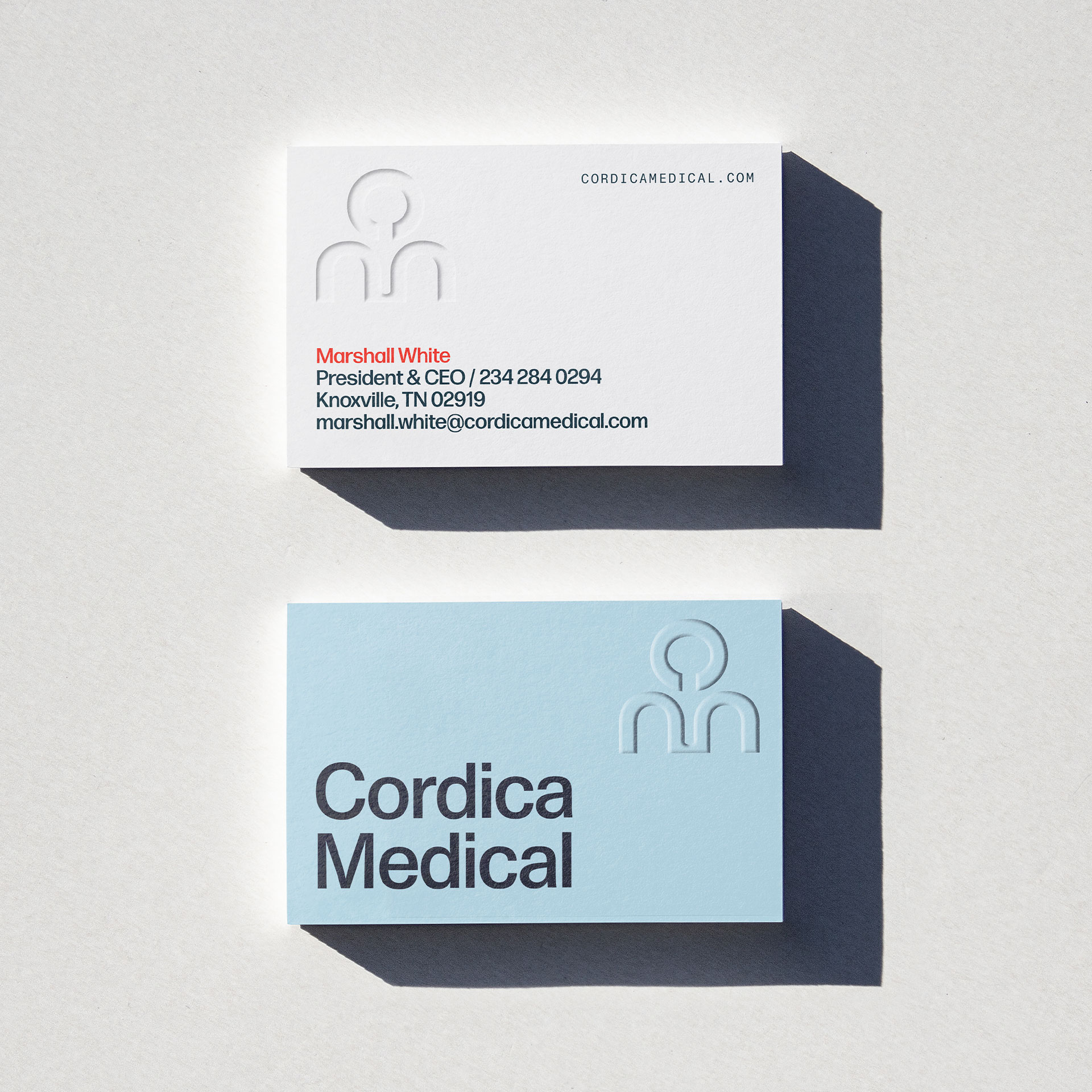
The name Cordica is inspired by the chordae tendinae, better known as the heartstrings. It's a nod to the cardiovascular work at the core of the company, but it also gets at something deeper: these are precision-engineered products that end up inside human bodies, keeping people alive.
Identity Design
The visual system is built around a cool blue gradient palette, accented by a single warm orange. The icon abstracts the human form into something that reads as both medical and structural: connected, precise, purposeful.
A Brand Vision
To launch the brand internally and externally, we produced a vision film that introduces Cordica Medical to the world — connecting the company's 30+ years of combined heritage to the forward-looking identity and the patients whose lives depend on the work.
Vision Film